The 2016 Pantone Colors of the Year are either completely fantastic or a little intimidating to the average human, so we put together an easy how to guide on how to wear and incorporate these soft-and-beautiful hues.

The Pantone Colors of the Year were recently named Rose Quartz, a soft but energetic pinkish hue, and Serenity, a soft bluish tone that makes you want to curl up in cashmere circa 1993 and drift off. While the colors are certainly beautiful, pastels are often intimidating to work into everyday wardrobes and life in general. I mean, how many people do you know are able to have pastel-infused homes that don’t resemble nursing homes? Not many, but there’s a way to do it that is super chic, simple, and will make everyone who sees you say “OHHHH… so THAT’S how to wear Serenity.”
- Work it into your comfy wear. Gym and lounge clothes are the ideal place to experiment with new color schemes and styles you’re generally not used to wearing. All that spandex leaves you feeling complete ‘out’ anyway, so why not go wild with color and print? Teeki yoga pants, $72 here.
- Try it in your eyeshadow. Pinkish hues are always flattering for greenish hazel and light brown eyes while shades like Serenity will bring out the chocolate tones in deeper brown and black eyes. Just don’t go overboard– remember to fill your crease in with a color 2-3 shades darker than your own natural skintone and use the colored portion of your eyeshadow game over the center of your lid. Cargo Cosmetics Essentials Palette, $34 here.
- Throw on a silk scarf. There’s no accessory as simple and elegant as a scarf. You can stick to wearing a LBD if you’d like, but adding a dash of Rose Quartz or Serenity (or both!) by way of a silk scarf screams out ‘HI! I’m gorgeous and timeless.’ The soft nature of these hues can also help cut through the severity of work attire. Ink and Tailor scarf, $220 here.
- Work it in under a suit. Men may have it a little easier when it comes to the 2016 Pantone Colors of the Year, and that’s simply because pale blue dress shirts have been a staple as long as coffee has been served in the morning. Pale red or pink stripes on those blue shirts have also become the norm, so working a well-structured French cuff into a man’s existing suit wardrobe isn’t hard at all. Shirt by Thomas Pink, here.
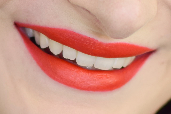
- Get glossy. Is there anything more neutral or flattering than a Rose Quartz lip? This is a question for the great beauty sages, but in the meantime we know for sure that it’s a universally flattering lip shade. Neutrogena lipgloss, $9.79 here.
- Add it to your kitchen counter. Imagine this– you have all stainless steel appliances and white or grey marble everywhere, as per the stylish and modern human that you are. Your kitchen likely needs a subtle pop of color, and the Serenity-enhanced Keurig is probably the cutest way to do it (short of Rose Quartz skillets for pancakes, but that’s another story for another time). Keurig 2.0 Brewer, available here Spring 2016.
- Shop in advance. These colors are obvious Spring winners, so take advantage of Winter sales on 2015 merchandise to load up on what will be the chicest for early-mid 2016. Again, accessories are timeless and don’t require shedding holiday pounds or deciding whether you like the way it makes your behind look. Meli Melo bag, now 25% off at ShopBop here.